Walls begin white. Color transforms them.
Somehow white gives off the impression of incompleteness, newness, and blandness. In order to develop an environment that instills a specific mood in the people in the room, people generally turn to color. The color of walls, floors, ceilings, cupboards, moulding, and window frames is essential in creating an atmosphere within a room.
The ability to completely alter a space without having to change its physical structure brings so much freedom to its inhabitants. Feelings of claustrophobia can be cured by lighter shades on the ceilings and walls. Illusions of warmth come from walls with orange and red tones.
Moving into my house where the wall color changes every few months and no cupboard or shelve remains white, I have really learned how color can transform moods. Now I sit in the green room, where I feel bright, wily, wacky, yet calm because the color is solid and secure. I look at pictures and remember when this room was bright red with blue trim. It made for a much smaller feeling room instilling strange emotions from seeing the familiar color combination of red and blue.
The power to actually alter the feelings, moods, opinions, and levels of calm with the simple act of applying paint to a wall is fairly amazing. Most people are very aware of the ways in which colored rooms affect their ability to enjoy their time spend inside those walls. This awareness affords many their first basic understanding of color psychology and color theory.
Color transforms the space. The space transforms the people. The people transform the color.

Monday, November 29, 2010
Dangerous Designs; Buttons Knobs Switches Dials
In our households we have the luxury of being able to saunter around flipping switches, turning knobs and pressing buttons until we are comfortable and satisfied. These actions become so commonplace that children grow up with the expectation to get what they want when they want it without considering the source. Wasting water has little effect on the conscience when one has grown up to understand that the faucet will always dispense water if you turn it.
Out of sight, out of mind. Flip the switch and on turns a light. Press the button and music starts. Turn the knob and water boils. Turn the dial enough and heat sneaks into every corner of the house. How much are we able to intuitively understand about the sources of these utilities by the ways in which we interact with them? The danger lies in the lack of understanding, and through that lack of understanding the lack of appreciation.
Middle class suburban folk do not need to know where their water comes from, as long as it keeps coming and as long as brita filters continue to be manufactured. Electricity is even more mysterious. I truly have no idea what actually happened that allowed energy to transfer from some unknown source to the outlet that allowed my computer to charge and me to sit here pressing buttons and making letters appear on a lit screen. For some, these unknowns are exactly what signifies progress and sets the mark for our standard of living. While we surely have progressed in order to reach this point, I still argue that the comfortable shell we hide inside now is dangerous. It is dangerous for the individuals physical and mental health and for the health of the world provides us with the means to live. It is far too easy and commonplace living within the current electrified suburban or city design to give our fingers and mouths the most exercise. Wake up, press buttons, turn knobs, eat food. Press buttons, turn key, arrive at work. Press buttons, wait for moving platform to arrive. Ride the platform up stairs, flip switches, turn on computer. Press keys dial numbers. Repeat the processes to arrive home again only to press another button and turn a knob for entertainment until you fall asleep. Plan ahead and press buttons so the moving pictures will stop once you drift off.


The design of the suburban life is comfortable and easy and exciting in a lot of ways. However, with the comfort comes the danger. Without understanding where the things we use come from, we are able to ignore the effects our use has on those sources. Without having to understand things like electricity, plumbing systems, water systems, and central heating and cooling we are less equipped to take care of ourselves and more likely to waste due to that lost connection.
Sunday, November 28, 2010
Gaviotas Creates Topian Technologies
“Appropriate technologies” are designed with special consideration for the environmental, ethical, cultural, social, political, and economical aspects of the community they are intended for. These technologies are created with a few crucial design constraints: affordability, durability, accessibility, ease of use.
The Gaviotas community in Columbia have successfully invented wind turbines, solar collectors, water purifiers, soil free hydroponic systems, and simple, efficient pumps in order to bring basic amenities and services to the people of the llanos. Rather than considering their designs “Utopian,” Paolo Lugari (founder of Gaviotas) insists, “Utopia literally means no place. We call Gaviotas topia, because its real.”
In the expansive plains east of the capital city of Bogotá, the indigenous Guahibo Indians and colonists of the area can only access to contaminated surface waters and live 16 hours from the nearest city with no paved roads to get there. Lacking fundamental services, Paolo Lugari brought together doctors, engineers, and experts from the Universidad de Bogotá and all over Latin and Central America to create devices to allow access to clean drinking water through pumping and purification.
To access the pure water in natural underground reservoirs, a mechanical engineer Alonso Gutiérrez invented a sleeve pump. By lifting a lightweight sleeve rather than the inner piston, the new pump didn’t require the application of force against atmospheric pressure, thus creating the opportunity to draw water from deep within the ground. The sleeve was light enough for a child to lift. Another engineer Luis Robles and some local children then developed an idea to attach the pump to a seesaw. As part of the Columbian government’s Agua Para Todos (Water for Everyone) program, this Gaviotan technology reached over 600 llanero villages.

During the 80’s, Gaviotans also designed a new hospital using solar technology to serve themselves and llaneros in surrounding villages. An interesting technology is this solar kitchen used in the hospital.

The kitchen uses low-viscosity cottonseed oil inside piping heated by the sun to heat pressure cookers. Sunlight superheats the oil which is then sucked into a holding tank on the roof by a heat siphon. A 40 watt micro pump run on batteries charged by photovoltaic cells is manually turned on, forcing the hot cottonseed oil through coils that loop around stainless steel pressure cookers and then return to the roof to re heat. Insulation of the tank allows the system to run 24 hours a day. Leftover charge in the battery can illuminate the rest of the hospital for the night. This is an example of a technology that may be too complicated and expensive to replicate for individual homes, but is perfect for public facilities like hospitals which serve most of the surrounding peoples.
Gaviotan engineers also brought their technologies out of the llanos and into the cities to help urban populations. Engineers trained street kids to help create hydroponic gardens on rooftops. The harvest leftovers were bountiful enough to supply a women’s cooperative and a reigonal grocery chain.
Gaviotas is an real example of the usefulness of appropriate technologies. It worked for Gaviotan engineers because the inventors refused to patent their products. This allowed the designs to be used and shared by those who needed them.
 Here is a Solar Kettle, designed to purify water through by boiling it and then cooling it to a palatable temperature.
From: Gaviotas; A Village to Reinvent the World by Alan Weisman
The Gaviotas community in Columbia have successfully invented wind turbines, solar collectors, water purifiers, soil free hydroponic systems, and simple, efficient pumps in order to bring basic amenities and services to the people of the llanos. Rather than considering their designs “Utopian,” Paolo Lugari (founder of Gaviotas) insists, “Utopia literally means no place. We call Gaviotas topia, because its real.”
In the expansive plains east of the capital city of Bogotá, the indigenous Guahibo Indians and colonists of the area can only access to contaminated surface waters and live 16 hours from the nearest city with no paved roads to get there. Lacking fundamental services, Paolo Lugari brought together doctors, engineers, and experts from the Universidad de Bogotá and all over Latin and Central America to create devices to allow access to clean drinking water through pumping and purification.
To access the pure water in natural underground reservoirs, a mechanical engineer Alonso Gutiérrez invented a sleeve pump. By lifting a lightweight sleeve rather than the inner piston, the new pump didn’t require the application of force against atmospheric pressure, thus creating the opportunity to draw water from deep within the ground. The sleeve was light enough for a child to lift. Another engineer Luis Robles and some local children then developed an idea to attach the pump to a seesaw. As part of the Columbian government’s Agua Para Todos (Water for Everyone) program, this Gaviotan technology reached over 600 llanero villages.

During the 80’s, Gaviotans also designed a new hospital using solar technology to serve themselves and llaneros in surrounding villages. An interesting technology is this solar kitchen used in the hospital.

The kitchen uses low-viscosity cottonseed oil inside piping heated by the sun to heat pressure cookers. Sunlight superheats the oil which is then sucked into a holding tank on the roof by a heat siphon. A 40 watt micro pump run on batteries charged by photovoltaic cells is manually turned on, forcing the hot cottonseed oil through coils that loop around stainless steel pressure cookers and then return to the roof to re heat. Insulation of the tank allows the system to run 24 hours a day. Leftover charge in the battery can illuminate the rest of the hospital for the night. This is an example of a technology that may be too complicated and expensive to replicate for individual homes, but is perfect for public facilities like hospitals which serve most of the surrounding peoples.
Gaviotan engineers also brought their technologies out of the llanos and into the cities to help urban populations. Engineers trained street kids to help create hydroponic gardens on rooftops. The harvest leftovers were bountiful enough to supply a women’s cooperative and a reigonal grocery chain.
Gaviotas is an real example of the usefulness of appropriate technologies. It worked for Gaviotan engineers because the inventors refused to patent their products. This allowed the designs to be used and shared by those who needed them.

From: Gaviotas; A Village to Reinvent the World by Alan Weisman
Monday, November 15, 2010
Under Where?
Underwear. What is it there for? Why do we consider underpants as a staple, a given, a necessity in our daily ritual of dressing and preparing for the day to come?
What are the main goals? Bantering with various friends, it seems we do this to have an extra protective layer...a layer of warmth...a layer of protection from rough pants...a layer to protect from exposure.
If these are the reasons we wear underwear, why do so many pairs seem to prove incapable of achieving these purposes?
On a trip to Macy’s over the weekend to purchase new underwear, the experience was much more of a game than I expected. Dodging between racks and tables stacked with thin, flimsy, synthetic fabrics priced at unreasonable amounts because the perceived uniqueness of the design and the idea that one will become attractive once inside them.
Slinking from table to table, seeing a pair that may finally fit the cut as plain, cotton underwear with fabric to warm the bum, you think you finally find a normal pair only to turn it over and read some statement attempting to define my character or making some commanding remark.
This bickering makes me feel like a worn out old woman. But I’d rather take that role and knit pick for functionality and simplicity than simply slip into a little pair of these just because they’re the most common things around.


Limmer Boot Ergonomics!
The five areas of ergonomic research offer a useful basis with which to criticize, praise, or analyze a design. They generally cover all of the bases and prioritize certain aspects of the design. Safety, comfort, ease of use, performance, aesthetics are the five categories with which to base criticism and are ranked in order of importance. I really agree with the priority each area is given. For items designed to be used in rigorous or technical situations, it is especially important to prioritize performance and comfort over aesthetics.
Limmer boots are quite possibly the optimum example of an ergonomically designed item that adequately addresses each of these areas. For hikers, workers, and general frequenters of the outdoors, feet can be exposed to harsh weather conditions, wet landscapes, heavy pack load, slick boulders, heavy tools, and unstable ground.
To assure safety, Limmer boots use a seemingly simple design to cover all the bases. The boots use a single piece of full grain cow hide to minimize seams and improve protection from water. Limmers have a reenforced leather fiber heel counter (a piece placed in between the lining and the outsole). The heel counter is present to protect the foot from a side impact and stabilizes the heel within the boot to prevent ankle turning. The boots also use side supports to protect sides and arches from impact. There is a toe box with reinforced fibers to provide protection from falling items. The shoes use a Vibram® sole which is an extremely tough and abrasion resistant bottom to protect feet from sharp protruding objects and to offer grip to prevent slipping.
In terms of comfort, the single seam and full grain leather feature on Limmer boots protects feet from water which can cause frostbite, colds, and fungal problems. The seam on the boots is located at the concave curve of the arch. Many other shoes use back strap pieces which require back seams. This creates an inflexible, rigid heel which can cause discomfort near the achilles tendon when descending. Seams can also create a ridge which can give the wearer blisters. As the designers stated “Back seams are a perfect example of a design that is not ergonomic.” One piece shoe backs with no seams allow the boots to mold to the wearers heels. Added ergonomically designed ankle and heel padding add needed comfort.
An open cell foam padded tongue with outer bellows facilitates the ease of use by facilitating the ease of entry while maintaining its water proof qualities. Limmer boot manufacturers create a custom shoe fitted to each foot specifically. If shoes create any discomfort, the company encourages the wearer to return them to the shop for adjustments.
In terms of performance, these boots are expected to last least ten to fifteen years at least. Among the crews working in the White Mountains, wearing out Limmer boots to a state of disrepair is a rare feat. A friend from a White Mountain trail crew met a retired crew member who worked in the Whites from 1978-1981, wearing the boots everyday. He still sports the boots today, 32 years later.
Check him out.

Limmer boots are attractive because if you know what they are, you know what they can do. Their aesthetic value is high because their simplistic appearance transcends period fashions. In a society where items like shoes barely outlast the rapidly changing fashion tastes, consumers are left with more things that accomplish less individually. Good designs consider the items ability to last and to fulfill its purpose.
The true effectiveness of their design is seen in consumer reviews and reactions. It has become tradition for hiker to photograph their feet in Limmer boots as the reach challenging and picturesque heights. It must feel good as the designers to know just how effective their product really is.
Here is the first picture sent to Peter Limmer showing the boots on top of Kathmandu in Nepal.

Sources: http://www.limmerboot.com/#
Limmer boots are quite possibly the optimum example of an ergonomically designed item that adequately addresses each of these areas. For hikers, workers, and general frequenters of the outdoors, feet can be exposed to harsh weather conditions, wet landscapes, heavy pack load, slick boulders, heavy tools, and unstable ground.
To assure safety, Limmer boots use a seemingly simple design to cover all the bases. The boots use a single piece of full grain cow hide to minimize seams and improve protection from water. Limmers have a reenforced leather fiber heel counter (a piece placed in between the lining and the outsole). The heel counter is present to protect the foot from a side impact and stabilizes the heel within the boot to prevent ankle turning. The boots also use side supports to protect sides and arches from impact. There is a toe box with reinforced fibers to provide protection from falling items. The shoes use a Vibram® sole which is an extremely tough and abrasion resistant bottom to protect feet from sharp protruding objects and to offer grip to prevent slipping.
In terms of comfort, the single seam and full grain leather feature on Limmer boots protects feet from water which can cause frostbite, colds, and fungal problems. The seam on the boots is located at the concave curve of the arch. Many other shoes use back strap pieces which require back seams. This creates an inflexible, rigid heel which can cause discomfort near the achilles tendon when descending. Seams can also create a ridge which can give the wearer blisters. As the designers stated “Back seams are a perfect example of a design that is not ergonomic.” One piece shoe backs with no seams allow the boots to mold to the wearers heels. Added ergonomically designed ankle and heel padding add needed comfort.
An open cell foam padded tongue with outer bellows facilitates the ease of use by facilitating the ease of entry while maintaining its water proof qualities. Limmer boot manufacturers create a custom shoe fitted to each foot specifically. If shoes create any discomfort, the company encourages the wearer to return them to the shop for adjustments.
In terms of performance, these boots are expected to last least ten to fifteen years at least. Among the crews working in the White Mountains, wearing out Limmer boots to a state of disrepair is a rare feat. A friend from a White Mountain trail crew met a retired crew member who worked in the Whites from 1978-1981, wearing the boots everyday. He still sports the boots today, 32 years later.
Check him out.

(Photo taken by Emily Dalymeyer)
Limmer boots are attractive because if you know what they are, you know what they can do. Their aesthetic value is high because their simplistic appearance transcends period fashions. In a society where items like shoes barely outlast the rapidly changing fashion tastes, consumers are left with more things that accomplish less individually. Good designs consider the items ability to last and to fulfill its purpose.
The true effectiveness of their design is seen in consumer reviews and reactions. It has become tradition for hiker to photograph their feet in Limmer boots as the reach challenging and picturesque heights. It must feel good as the designers to know just how effective their product really is.
Here is the first picture sent to Peter Limmer showing the boots on top of Kathmandu in Nepal.

Sources: http://www.limmerboot.com/#
Monday, November 8, 2010
Hace Frio, Que Debo Hacer?
How can I design a simple way to stay warm for the winter? Living in an old farmhouse without the luxury of central heating, I must get creative in order to successfully roam the house and relax or work in various places without interrupting myself with shivers or complaints.
Step one: What are the places on the body where we lose most heat? Covering the head and toes is essential. I must knit myself a soft woolen hat that I can wear all day without transferring my distractedness to an itchy head from a scratchy cap. Socks are also one of the most crucial stay warm items. By wearing very long woolen socks I can stack functions, keeping my legs and feet warm.
Next comes the actual body. I am finding that one can insulate far better by wearing loose clothing of quality fabric rather than skin tight clothing. The extra room allows for movement which heats the body.
Aside from what I put on your body to warm it, there are things I can redesign in the space around me to select for a warmer climate. Curtains for the windows! Homemade window insulation! Cups of tea and piles of people. With this knowledge I will hopefully be prepared to design my getup and my environment to prevent shivers, lost sleep and grumpy moods throughout the winter.
Word and Image as Teaching Tools
Children’s book authors may know best the benefits of placing words and images together to help the reader better receive the intended message. Images are essential components of a story as children are learning to process the visual representation of language. The idea is, hopefully the child will be better prepared to understand the word if there are familiar hints close by. If for whatever reason the child cannot process the words on the page, they will at least understand the concepts through looking at the pictures and so are able to still enjoy the story. The image may also just help to reinforce the names for objects the child already knew but perhaps not well enough to conjure up on their own.
Take this example. Here the words “Crocodile” “Hips” are conveyed well through the use of silly and bold images.

Images are so important in the learning, understanding, and absorbing processes that they remain in children’s books for a large part of the developmental years, gradually being phased out in the later years of elementary school. Early on the words accompany the images, and as one grows older the pictures are a treat, occasionally accompanying the words.
Something to chew on....if pictures are so crucial in tackling the difficult task of conveying complex ideas or concepts to very young children who have yet to develop the use of language, then why do they become merely extras or bonuses in educational texts as those children age?
Brain Teasers: Playing With Word and Image
According to Scott McCloud, the arrangement of word and image has been used historically to thoroughly or completely convey a message. The combination of the two is usually used to convey an idea that needs more explanation beyond words.
Comics are a common form of art and communication that juxtapose image and word. Appearing in most newspapers near the comic section, one might find a different combination of word and image, ones that intends to confuse and to trick rather than clarify. These combinations, commonly referred to as brain teasers seek to accomplish a very different goal. The reader/viewer leaves the experience feeling smart, clever, accomplished and capable if he can figure out what the author is trying to say. If not, the person may leave with feelings frustrated and incapable.
The content in brain teasers, what the author is trying to say is usually very different than the content in comics. The main goal of a brain teaser is to confuse the mind at first glance and then force the onlooker to think in ways they are normally not asked to explore. This new perspective is necessary in order to synthesize the layout/structure of the words (what I would consider the image) and the letters themselves. The mind must separate from the common practice of reading a word and in doing so receiving the information intended for conveyance by the author. With brain teasers, the reader must do more than read. They must proccess the letters while simultaneously recognizing how they are arranged, the image they display.
Here is a very simple example that expresses what I am trying to say.
R
O
ROADS
D
S
We first read the word “Roads” twice. That makes little sense. We must assess the situation further to understand what is trying to be conveyed. Now we notice the two words are arranged in such away that they resemble a cross symbol. Hmmm, perhaps....CROSSROADS!
Now my brain feels capable and properly exercised.
Monday, November 1, 2010
Dye It Yourself
 |
| Photo taken at the Yolo Wool Mill annual Mill In. Variety of yarns soaking in natural dyes. |
The process is usually very simple; chop up plant/fungal/seed matter, simmer in water, add vinegar, add yarn and soak. Many plants require an extra step however which sometimes can complicate matters.
Many dyes need “mordants” to fix the dye to the fiber. It allows the fiber to open up and accept the dye more easily. This creates problems for those who are looking to use natural dyes to make the process cheap and environmentally friendly. Chemical mordants like chrome, copper, tin, and iron can be treated as hazardous waste and must be purchased by the dyer.
For a more simple, cheap, and less hazardous process there are a few plants that can function as natural mordants. Rhubarb leaves, Sheep Sorrel, and Fir Clubmoss.
“Modifiers” are also used to alter the pH of the dye bath to change the color results. Ammonia is usually used to make the dye bath more alkaline. Ammonia can potentially cause respiratory problems and skin inflammations. Soda ash and even wood ash can be used instead to alter the dye bath color.
In tinkering with these processes, designers can create consistently unique yarns and fibers. The process allows designers to relinquish control and feel okay leaving things up to chance to a certain degree. Play and experimentation are very important for the design process.
By bringing the dyeing process to your own kitchen or back yard, designers also can become more acutely aware of regional plant life.
Industrial Design: Gore-Tex

With the mass production of outdoor footwear, it is very rare to find leather boots made from a single piece and naturally waterproof.
In order to add this very important feature to industrially designed, mass produced outdoor shoes Robert Gore patented a waterproof fabric called Gore-Tex. The primary marketable aspects of Gore-Tex are its waterproof and breathable qualities. The design using this fabric is focused less on pattern and appearance and more on comfort and function. Emphasis here is focused on the whole over the parts. The individual layers of various fabrics which make up Gore-Tex goes unnoticed to the consumer because the important elements of the design occur mainly at the microscopic level.
This waterproof sandwich of fabrics is composed of a thin, fluoropolymer (Teflon) membrane bonded to a fabric. The membrane has 9 billion pores per square inch, with each pore being 1/20,000th the size of a water droplet. This design was found to have problems however because the outer Teflon layer is easily damaged. As a result a revised design adds a polyurethane layer as the inner “protection” layer and another lose fabric shell layer.
While the design of this breathable yet waterproof fabric is very exciting and useful for outdoor gear companies wishing to mass produce water-proof active wear, there are a few drawbacks.
Dirt and human perspiration can block the pores of the Gore-Tex membrane causing it to lose its breathable feature. This can be remedied by washing, however washing shoes is difficult
and cleaning can reduce the performance in general. Gore-Tex products, like almost all other mass produced outdoor gear on the market has seams. Seams on Gore-Tex products are taped over, but with time and wear this is another potential area for water to enter.
Also. in the process of creating fluoropolymers which are in the Gore-Tex materials uses a fluorosurfactant PFOA. This surfactant has potential to exist indefinitely in the environment and to bioaccumulate.
The invention of this fabric structure will most likely be ever changing, with chemists constantly altering the chemical structure of the various layers as well as the composition of the fabrics to create the end product. So far, Gore-Tex seams to be a very intriguing invention worthy of a close look.
Objectified: Interaction of Form and Content
Objectify: To express something abstract in a concrete form, to degrade to the status of a mere object
The film “Objectified” provides viewers some insight into the industrial design process, something we rarely hear or think much about. Using Lauer’s principles of form and content we can start to decide what is the ultimate concept of “Objectified.” What message is being delivered?
Specifically, the “content” refers to what is being told or communicated to the viewer, and “form” refers to the techniques or visual elements used to share the content with viewers. Within this film, form and content interact on multiple levels. First is the broader level; the overarching theme (content) speaks to the audience through a series of interviews with designers and video clips/images of the design and production process with narration in between clips (form). Second is very similar but a bit zoomed in; each individual segment makes its own points on what design is through music, images, interviews, and voice overs.
Looking at the form and content of the broader version (the movie as a whole), I felt the movie did well to provide us viewers with a really unique look at the design and production of everyday objects like potato peelers and toothpicks. Video clips of designers in their studios creating their projects leaves the viewers in awe, fascination, and confusion. These moments are interrupted by commentators making statements to make us think a little harder, to move past a state of awe into analyzing the bigger picture. It really impacted me when a woman mentioned that now form bears no relation to function in objects. The invention of the microchip has allowed designers to create items like the IPhone which is a calendar, a phone, a computer, and a camera all in one, but based on appearances alone seems to be none of those things.
The final message or concept is somewhat ambiguous. The two competing messages seem to be this; 1) Design is constantly improving objects, and industrialization improves our means to share those designed objects with the population at large and 2) Inherent in this mass production industrial design model is waste, designing for the sake of creating more rather than creating better. I think the film does a good job of presenting these two sides through a balance of designs and designers represented as well as through the commentary. Each of us are then left to interpret the final message for ourselves...and I am sure many of us left the film focusing on a slightly different overarching concept.
Monday, October 18, 2010
Medatative Motions

Design is a process, and the process is the best part. In many circumstances, the more repetitive and time consuming the process, the better it can serve the psyche. Meditative processes like the Zenga practices of Zen Buddhist painting require patience, perseverance, and a focused departure from analytical thought. This meditative state of motion is why I design.
By laboring over repetitive tasks, one has the opportunity to put so much purpose and positive energy into the end product. It is rare that we are able to feel at ease when performing tasks that do not provide instant gratification. By knowing from the onset that a project will take time and require a small series of motions, repeated thousands of times over provides us with an excuse. A reason to slow down, to concentrate on a few simple tools or materials, to drown oneself in the process and learn to appreciate the significance of the current technological climate we live in. We generally do not have to do many tasks by hand anymore, and without this need, it is easy to treat items as dispensable and unremarkable.
Think about it. Imagine creating that cotton shirt from scratch! Such a tight weave! Such thin fibers! How does one grow cotton? How in the world does one spin those short seed hairs? How long would it take to weave that fabric by hand? Once I experienced the process of creating and weaving fabric, I can no longer treat a t-shirt as mundane. By cutting out the crucial pieces of the process, we are missing out on some of the most important benefits of the creation process. Appreciation for materials, understanding of processes, opportunities to slow your mind and eschew stress, desire to cherish and value the end product.
The repetitive motions one goes through when weaving fabric offers something for all of the senses, bringing us to a level of heightened awareness and increased tranquility simultaneously. Watching the yarns rise up and down, feeling the pedals with my toes, hearing the rhythm of the rising and falling shaft, and tasting the satisfaction.


Compare and Contrast; Why Womens Clothing is not Created Equal
Form vs. function. Appearance vs. purpose. Quantity vs. quality.
Why does the design of women’s clothing seem to always prioritize the second category? I take offense every time I put on a pair of pants with pockets in which I cannot fit four fingers, with belt loops too small to hold that rectangular strip of material that is intended to hold my pants in place. It is far more difficult than it should be to find a warm jacket with pockets or who’s buttons continue all the way up to keep the neck warm. Do women not need to carry items larger than a breath mint? Do we not need to keep our hands and necks warm? It must be assumed by designers that appearance is the top priority, and functionality can be stunted as a result.
I suppose shopping for women’s clothing does have its benefits if one desires a varied and vibrant shopping experience. Clothes are made more cheaply so that consumers can afford a taste of every style, every color. There are usually so many options. It is easier to find underwear plastered with images of lifesaver candies and configured in all these goofy shapes than it is to find a plain and durable set. Men have it simple. White, grey, or plaid. Large, medium, or small.
These marketing attempts to sell cheaper clothes of questionable and fleeting styles creates a culture of consumption in abundance, because no one item has all of the essential characteristics. One pair of pants has holes strategically placed all over the knees, and so a pair of leggings is needed to protect from cold.

Our shirts are thin and flimsy, displaying icons, pictures or phrases that seem exciting for a moment but soon become trite or embarrassing when tastes and opinions change. Look in any outdoor magazine and you will find quality, simple, durable, and functional boots for men. Turn the page to see attractive sandals for women, too flimsy to be worn rock climbing but expensive and desirable nonetheless because they carry a brand name that advertises the functional qualities that are seen in only the men’s section.
Someone who is doing it right: http://www.redantspants.com/index.php
Design as a Conversation
We all know music speaks...but what does that really mean? The construction of tone, pitch, rhythm, articulation, harmony, voids, pauses, structure and chaos is so wonderfully perfect yet perplexing and complicated. Why does it all happen? To express! To communicate in ways that are unsatisfactory when just using language or images. How does it happen? Design.
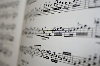
Music has very powerful communicative qualities, and many different types of conversation happen simultaneously. When playing written music, the musician is faced with interpreting symbols and spaces to communicate non verbally with the unseen composer. A specific and intricate design has been created and widely accepted to allow an artist to share their inner rhythms with future strangers. And when these players play, others hear. Many listen. Everyone feels.
These tones stacked upon tones arranged into melodies are interpreted as sound...noise...music.
Conversation then extends beyond composer, player, and listener. Arguably the most powerful conversation occurs between players, between musicians. It happens as vibrant, nonverbal communication that requires the perfect alignment of tones, notes, timing, rhythm. The synchronicity of these specifics is crucial, usually coming from a place lacking forethought, or planning. Decisions are made in a split second. Players maintain a series of patterns while simultaneously processing the patterns created by the others and attempting to feel where the other may head next so that they can react.
How fascinating! This surely emphasizes the difference between planning and design that Terzidis brings up in the Etymology of Design. ‘Design’ is “a conceptual activity...intended to be carried into action.” Planning is “the act of devising a scheme...for the accomplishment of an objective.” Jamming with others is certainly carrying out an action...giving emotions and hidden talents a perceivable form.
And the conversation continues! Faced with the right arrangement of sounds and tempos, the rhythm creeps into the bodies of those who are present but not playing. Suddenly they cannot help but bend a knee, nod a head, tap a foot, wiggle and bounce and jive. The reactors, the dancers, the movers, the wigglers could not help but join the conversation. Suddenly it all connects. The drummer starts a pattern, the pianist strikes a chord and the flautist whistles a ditty, and the dancers move. The musicians see the dancers and egg them on. The dancers hear the tunes and continue moving. The music ends, everyone goes their separate ways, drumming their fingers, adding a skip in their step, keeping the beat alive.
Monday, October 11, 2010
Living With Intent; Functional Spaces
When living with fourteen people in one modest, 5 bedroom house, we all cannot help but think about design. We must be creative with our space. It is tricky to give each individual a space of their own and also find storage for extraneous personal items. Through this experience I am learning one of the most important lessons: we don’t need that much space to live comfortably.
It seems as if the living space dictates the lifestyle of the occupier. Its very simple really. The more rooms, cupboards, closets, attics, basements, and sheds...the more we will find things to fill them with. My parents house has multiple rooms stuffed to the brim with strange decorations, trinkets, and extra things we never use because 1) we cant access them and 2) we eventually forget they are there. After all....there are plenty more things in the other rooms.
Living in luxury does not mean burying oneself in stuff. The PBS special “Living Large: A Look Inside the Tiny House Movement” on the program Need to Know is a perfect example of this. A woman from Olympia Washington built herself an 84 square foot home...on wheels. The video takes you into her home and shows the elegant beauty she has found in practical simplicity.


By designing a living space with intent a deeper connection can establish between the person, the place, and the items in it. One suddenly knows what they have and why they have it. If the why is unsure, it probably didn't make the cut.
The Tiny House Movement is growing. I highly suggest getting inspired:
http://turnbulltinyhouse.blogspot.com/
http://tinyhouseblog.com/
http://www.littlehouseonasmallplanet.com/index2.html
It seems as if the living space dictates the lifestyle of the occupier. Its very simple really. The more rooms, cupboards, closets, attics, basements, and sheds...the more we will find things to fill them with. My parents house has multiple rooms stuffed to the brim with strange decorations, trinkets, and extra things we never use because 1) we cant access them and 2) we eventually forget they are there. After all....there are plenty more things in the other rooms.
Living in luxury does not mean burying oneself in stuff. The PBS special “Living Large: A Look Inside the Tiny House Movement” on the program Need to Know is a perfect example of this. A woman from Olympia Washington built herself an 84 square foot home...on wheels. The video takes you into her home and shows the elegant beauty she has found in practical simplicity.


VS.

By designing a living space with intent a deeper connection can establish between the person, the place, and the items in it. One suddenly knows what they have and why they have it. If the why is unsure, it probably didn't make the cut.
The Tiny House Movement is growing. I highly suggest getting inspired:
http://turnbulltinyhouse.blogspot.com/
http://tinyhouseblog.com/
http://www.littlehouseonasmallplanet.com/index2.html
Design From Without
Our world is vast, diverse, complicated, colorful, intricate, fascinating, brilliant, and full. When a designer/artist/creator ponders what to manifest and how to do it, those decisions are usually based on something outside oneself, something that exists separate from the designer in this abundant universe.
Think about how seemingly impossible it is to be original in this world. In Terzidis’s critical article The Etymology of Design; Pre Socratic Perspective, he mentions a common assumption of pre socratic philosophers who believe “nothing comes out of nothing and nothing disappears into nothing.” Whether or not this statement is absolute truth or all inclusive,there are positive and negative influences everywhere, and there is no shame in drawing inspiration from those influences...from without.
I find that my best projects are such because they are inspired by others. Many times it is much easier for me to design and create for someone else than for myself. To decide what to create, I must let that persons aura consume me, I must pay attention to obvious things like the colors that remind me of their personalities and then progress towards more abstract thought. What do they need that they don’t already have? How can I improve something of theirs that is broken or mundane? Does their persona generally feel practical or whimsical? How can I surprise them?
Making or fixing things for others really knocks you into another world, analyzing that person and using those thoughts to inspire the design.

This quilt was inspired by and given to a very close friend. The project happened because this persons character inspired me daily, and deserved something special. Then the question is, what to make? I chose a quilt after observing and experiencing a bedroom in dire need of color and excitement. At this step, other factors had influence as well. Sacramento’s climate is hot and miserable in the summer, but very cold in the winter. With this, I chose to use a thin and lightweight wool batting, perfect for both seasons.
Going to a fabric store to choose prints could turn into one of the most overwhelming tasks. The options seem endless. Inspired from without, I narrowed it down quick, instantly drawn to fabrics that had the right colors but also showed patterns that represented more. The triangles look like mountains, where he loves to climb. The little specks resemble leaves, he is a plant fanatic. The colorful streaks instantly make me think of a painting of his grandmothers.
The receiver inspires ideas, patterns, form, color, and purpose. Most importantly for me, the source of inspiration (in this case Eric) gives the production process meaning and importance. Some projects take days, hours which are spent sometimes with tedious, intricate detailing. Every stitch remindes me of the person, of how much they deserve the gift and how perfectly they will jive with a design unknowingly inspired by themselves.
Sunday, October 10, 2010
Stone Soup
Stone Soup is so valuable as a story, an activity, and experience, a moral. What a concept! Pooling resources for the common good. A very simple idea yet I feel like the brilliance of this concept is no longer obvious. For many, life seems to be spent in a subtle and perhaps unconscious competition and more often than not we are concerned with succeeding as individuals rather than as a community.
Perhaps it is just because many lack the experience of strong community, group work, common vision/goals. Without this, it is hard to see the benefit of dealing with more opinions, ideas, concerns than just your own.
Because of this loss of connection with positive experience in cooperation, we NEED stone soup... in any shape or form we can have it.
The University can be an extremely competitive environment because ultimately, each individual graduates alone, and is permitted to do so after judgement is passed solely on the work they completed and the grades they received. However, no on truly reaches that point alone. We thrive off of ad grow from observation and interaction with others.
The stone soup activity in our Design class certainly planted a seed, or at least reawakened something out of dormancy. The tinkering, creative, curious and experimental child within each one of us was finally encouraged and actually instructed to come forth.

In a large lecture hall with hundreds of students so focused on capturing every word and date in our notebooks, we hardly allow time to look at those around us and get to understand their best qualities.
By going outside, sharing odd found items, and attempting to use those to create something worthwhile, we were able to learn a little about each other as designers and benefit from each others examples.
Working with a group assures you will have most everything you could need. I brought many wild items (bodysuit, cape, shield) but didn’t even think to grab glue, tape, pipe cleaners, scissors....all very necessary items.
Our group worked together seamlessly. Building off of one item, a large painted bodysuit, we began to just create in smaller groups without worrying too much what the ultimate goal was, creating a story as we went. Some people began tying sticks together for hair, others adhering the body to the tree, others creating faces and inventing personalities for the characters.
Seconds before the time was up, the story came together.
The little blue paper/plastic boy had close family members who recently passed away. (They are the gnomes in the picture he’s holding). The sheer grief caused him to lose his mind and create an alternate reality where he lost control of his own body some wild flying man (the creature in the tree) was puppeteering him from the sky.


I love the story, and the calm playtime. Hopefully this experience set off a spark of creativity inside everyone and reminded us to find community and share resources to make this huge and unfamiliar place feel richer and more intimate from cooperation.
Monday, October 4, 2010
Words, Words, Words
I believe that Kostas Terzidis's critical analysis of language and its origins in the article "Etymology of Design" helps to put the paradox of design into perspective. According to Terzidis, design is the "...process of genesis, emergence, or formation of something to be executed."
The word design traced back to Greek origins come from the past tense of a word pronounced 'eho' which means to have, hold, or possess. From this, Terzidis reasons that design is about "something we once had, but have no longer."
If this is so, why do we still design? Are we trying to recover, recreate, and rework ideas from the past or are we capable to giving rise to completely new or "innovative" ideas?
Thoughts popped up when diving into the definition of innovative; "The act of beginning or introducing something for, or as if for, the first time."
Perhaps perceiving ones ideas as "new" is healthy for the inspiration and creative soul, but there is also no shame in reuniting with ideas from the past and incorporating them into present circumstances.
I believe, as a consumer, it is interesting to take the time to analyze advertised items, keeping in mind the power of loaded words such as "new" "innovative". One can ask if these advertisements speak truth, if similar designs have existed under different names in the past, if the "new" is always a desirable trait. These type of feel good blanket statements may distract from analyzing the quality of the product itself, innovative or not, and erase acknowledgment for those whose ideas from the past inspired the current twist.
Thus, it is very important to keep the syllogism "If something is percieved as such, then it must be such" in mind when playing the part of consumer. That people may be "conditioned" to perceive something untrue is a frightening prospect but can be avoided by maintaining a critical eye. What do the words in advertisements really mean? Do they speak truth? Does it even matter?
Digging Curves
Straight lines seem to dominate structures and landscapes shaped and formed by human hands. It is difficult to notice these things without experiencing an alternative. Right angles form doorways, shelving, windowpanes, books, speakers, chairs, dressers, counters, cupboards, piano keys, spacebars, the list is endless. Walking into the garden, I step down stairs, each forming a perfect right angle with the stair below. Finally, into the garden I enter a world of shapes and patterns created with purpose, inherently brilliant and full of life. However, this orchestra of natural form is interrupted by the straight lines, rows, that gardeners create to form neat and tidy microclimates where these natural forms can grow.

Yesterday, some friends and I opted to try something new. I have been very drawn to the guiding principals and strategies of the every growing ‘Permaculture Design’ movement which seeks to establish and regenerate human settlements in such a way that has a positive impact on the natural environment. Using this design methodology, I decided to experiment and change the row structure in our garden. I chose to bend the lines, forming a circular planting bed to increase planting area and decrease path area. Paths pound our carefully worked, fluffy loam soils into hardpan which is not suitable for plant growth. By creating a circular bed with only one radius like path, maximizes the plant friendly area.
Heres how it happens. If we take a typical 4 ft by 15 ft raised bed garden and bent it into a U shape with a small opening for a path leading to the center, the path shrinks from roughly 22 square feet to 6.

 The circular shape of the garden is equal to if not more important than the path square foot specifics. Curves more closely resemble natures tendency to form meandering, graceful, and undulating shapes. Somehow curves are able to put me at ease, draw me in and make me want to stay.
I will keep updates when our little seeds begin to grow...

In the community where I live, this straight landscape design has become tradition.
Yesterday, some friends and I opted to try something new. I have been very drawn to the guiding principals and strategies of the every growing ‘Permaculture Design’ movement which seeks to establish and regenerate human settlements in such a way that has a positive impact on the natural environment. Using this design methodology, I decided to experiment and change the row structure in our garden. I chose to bend the lines, forming a circular planting bed to increase planting area and decrease path area. Paths pound our carefully worked, fluffy loam soils into hardpan which is not suitable for plant growth. By creating a circular bed with only one radius like path, maximizes the plant friendly area.
Heres how it happens. If we take a typical 4 ft by 15 ft raised bed garden and bent it into a U shape with a small opening for a path leading to the center, the path shrinks from roughly 22 square feet to 6.

Here are the beginnings of a keyhole bed started on October 2nd.

I will keep updates when our little seeds begin to grow...
Saturday, October 2, 2010
Early Memories of Design: The Mirror Toy/Portal
For as long as my memory allows, I have connected with objects in an intimate way. Luckily, I am still filled with that childhood wonder that convinces me everything is alive, each nook, blotch, bump, and smell knows its purpose and humbly flaunts it. As a child, I never thought about the designer. My appreciation for an object's intricacies and quirks was directed at it's physical properties, not the unseen mind who dreamed it nor the hands who created it. Young children frequently have the ability to live in the present, appreciating an object for the sensations it brings rather than analyzing its history.
I can vividly remember such an vibrant appreciation for a seemingly simple object from my early childhood. A simple square hand mirror with a notch sliced out of the bottom. I found this notch confusing and intriguing. Sure, it was just a little mirror, but the simple alteration in its design caught my attention and held it tightly. I noticed the shape of the missing piece fit the bridge of my nose perfectly. Holding the mirror reflective side up, I was suddenly afforded access to the world above me without straining my neck. With this new power, I became acquainted with the intricate architecture of my ceilings like never before. Wandering around for hours, stepping over doorway over hangs, in and out of the strange yet beautiful hardwood grid that formed my fancy ceilings.
So many new questions!
Why on earth do our ceilings have such complex patterns?
What function do they serve? No one ever even looks at them normally. Its a good thing our floors aren’t constructed like this...
If that silly little notch in that small simple mirror were filled, I wouldn’t have given that mirror a second glance. If my learned analytical thought process dominated my imaginative curiosity, I would have reasoned the notch was fit for a thumb without ever considering holding it up to my nose and under my eyes. How silly, that a little missing piece was able to complete the picture.
If that silly little notch in that small simple mirror were filled, I wouldn’t have given that mirror a second glance. If my learned analytical thought process dominated my imaginative curiosity, I would have reasoned the notch was fit for a thumb without ever considering holding it up to my nose and under my eyes. How silly, that a little missing piece was able to complete the picture.
Subscribe to:
Posts (Atom)